Posts

Showing posts from January, 2020

deconstructing logos

Image
                                         Colour- black- simplistic and classic, black has connotations of class and style for example suits and high fashion.  White- pure however this can be seen as ironic as the brand stands for everything but pure. it is a contrast to the harsh black colour.  shape- shape of a bunny seen to be cute as bunnies are sweet and innocent however this is also ironic considering what the brand is known for.  sharp outlines bow tie- also denoting class and sophistication.

analysis of forteanTimes

1) Fortean Times Name of magazine "forteanTimes"- a magazine about the worlds stange phenomena. cost, frequency and supposed target audience cost- £4.50 frequency- monthly target audience- ?   Aesthetic, style and major design decisions clean cut with bold but profesional looking fonts and layout.  use of similar covers on the front cover, text in blue and white to anchor with the main image. aesthetic is eerie but in an adult way  articles always in long collums with major titles at the top. lexis, language and modes of address lexis is formal and sophisticated.  mode of address is general and not made personal 

newspaper industries + conglomerates

newspaper example of conglomerate + subsidiary disney- owns national geographic, fox news, abc, 20th century fox. unileaver- vaseline, hellmans, ben&jerrys  what is an issue with a a conglomerate owning multiple multiple media companies in different industries? by owning many companies in many industries it gives them a lot of power but

set text magazines, Woman(1964) +modern comparison

Image
          WOMAN COVER (1964)                                      context: week ending august 29 (1964) beatlemania (cultural revolution, music art and film) JFK assasination- camelot- hope decade before (50s) was more make do and mend after the war whereas the 60s was more about spending and feeling more free. shift to consumerism "shop and spend" 60s was a sexual revolution, sense of female liberation. freedom in fashion- women in trousers introduction of contraceptive pill + married women's act (enables women to get a larger amount of financial independence) published by an organisation called IPC this magazine was selling roughly 3 million copies a week in 1960 Analysis: this front cover is not using the celebrity image instead it uses the average woman, not someone distinctly recognisable but someone we can identify. pull quote from Alfred Hitchcock, very recognisable famous film maker. representing that men should be more heard than women, more im

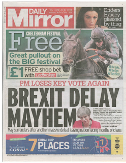
in depth analysis: Daily mirror set text

Image
 context: it refrences: ladbrookes- betting Eastenders TV show cheltenham festival references a previous vote coral- betting shop assumed knowledge: know what brexit is enders refers to eastenders the tv show may = the PM audience is of legal betting age ideological perspectives: people are fed up of brexit betting is ok and it encourages you do it  be interested in celebrity culture Codes and conventions- it can be argued that the image of Theresa may has become synonymous with the idea of brexit, almost like she is now a symbolic code for the topic. "mayhem" could also act as code as "May" is also the egining of mayhem suggesting chaos but also the surname of the PM. layout and design- on the front cover there is a lot going on seeming almost chaotic as there's a lot to focus your eyes on at first glance. things are layed out in "blocks" e.g red block in the top right vorner (the masthead) another block on the right